The logo you design is what people will recognize your company by, which is why you must ensure that you choose something that will be memorable and attention-grabbing. However, designing a logo is a process that can be time-consuming, overwhelming, as well as stressful for everyone involved, after all, it will represent your entire brand.
There are various programs and tools such as Turbologo that you can use, however, you’ll still need to learn what you need to focus on when designing. And luckily, there are various tips and tricks that you could use, all of which will help you create a logo that will suit your company well. Let’s take a closer look:
1. Incorporate a Visual Representation
As the saying goes “a picture can paint a thousand words”, which is one of the reasons why you should incorporate an image, more specifically, a simple icon that will clearly communicate what your brand is. For example, if you are the owner of a travel agency, an image of an airplane and sun will be suitable since it will remind people of warm holidays.
2. Leave The White Areas Alone!
If your goal is to ensure that people can read your logo from the distance – as well as recognize it easily – you’ll want to leave the blank spaces alone. Hence, if there are different elements in your design, keep it clean by leaving some white areas between the image and/or different words. This is something that will also help you with other merchandise such as printing T-shirts or posters.

3. The Shapes Don’t Need to Be Conventional
If you want to stand out from the crowd with your packaging, you’ll need to think carefully about the shape. For example, if you want to be professional, you can choose to literally place it inside a box. This won’t only help with keeping everything clean and professional, but, you can also properly use it for cross-platform branding.
How can it help? Well, boxed-in logos can easily be incorporated into digital content, letterheads, presentations, as well as other merchandise you might want to have such as pens, notebooks, T-shirts, and so on. Hence, thinking about the shape of it is also an important aspect of any design process. Keep in mind, the shapes do not need to be conventional, so, try different options out.
4. Think About How And For What You’ll Use it
You already read that you can use the design for various things, however, it is worth mentioning that it is important to think about exactly what you’ll use it for, as well as how it will look on different items. Whether it is a uniform, T-shirt, coffee cup, or pen, you must ensure that it looks good on different things – which you can do by using a mock-up generator.
5. The Colors Are The Most Important Features
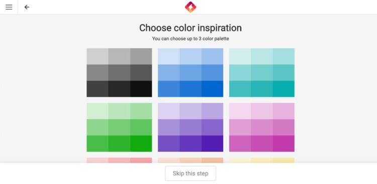
If there is one thing that you should take away from this article, it is the fact that you must choose the colors carefully and wisely. Black and white can be uncomfortable for the eyes at times, especially if you want to create a calm and zen feeling with your clients.
For example, if you are promoting a spa, you won’t want to use neon, bold colors, instead, you’ll want to use colors that will create that soothing feeling you want, hence, it might be best to use lighter shades of blue, pink, or green. Also, creating subtle contrasts is important since it will help your consumers focus on one thing at a time.
6. Being Literal Can Be The Answer
Does your company deal with fixing computers and other electrical devices? If so, do not be afraid to implement it in your design as well. Companies such as Apple Inc. did this, and they are one of the recognizable and used brands in the world. Hence, if your name is a real item, make that item your logo.
7. Ensure That it Suits Your Brand
Although you should be literal, you need to ensure that the picture suits your brand well. This means that you need to choose every aspect carefully, including the image, shape, size, color, and more importantly, the font. The font can help you quite a lot when designing, hence, ensure that everything suits your brand well.

8. Add a Pop of Color For The Head Turning Effect
You might have already chosen the colors you’ll use, however, did you consider adding a pop of color for that head-turning effect? As an example, let’s take the ‘Amazon’ logo. The letters are black, however, instead of leaving it flat and boring, they added a yellow arrow under the title, and this is exactly what creates the appealing effect you might be looking for.
9. Avoid Being The Same
Generally speaking, there are various designs that represent different things, but look completely the same. This is something that you need to completely avoid, especially since you want to stand out from the crowd. Hence, when working on designing your logo, look at your competition and what they are offering. Doing this will ensure that you do not design something similar as other companies did, hence, making you different.
10. Simple is More at Times
You do not really need to have a logo that is quirky, colorful, and vibrant, instead, you can also opt for a simpler and more minimalistic logo that will represent your company perfectly, but that will also make your stand out. Again, Apple is a great example since all they chose for their logo is a ‘bitten apple’. Hence, think whether or not something like this will work for you as well.
Conclusion
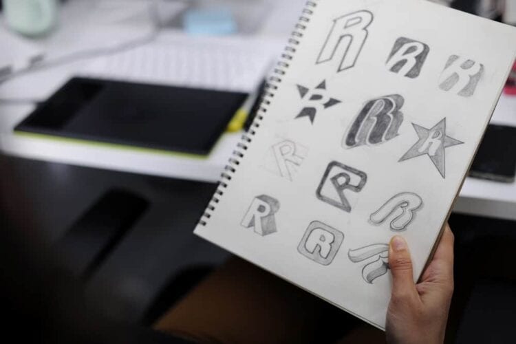
As we mentioned at the beginning of the article, the entire process of designing a new logo can be time-consuming and stressful, however, by following some of the tips from our list, you’ll be able to make the entire process easier and simpler for yourself, especially since you’ll know exactly what you need to focus on.
So, now that you are aware of all the things you’ll need to focus on in order to design your logo, you should not waste any more time. Instead, you should return to the beginning of this article, and start with the first thing we recommended, which is determining what your visual representation will be.

