Your site is outdated and traffic has dropped significantly compared to the beginning? You have invested a lot of money in its design, but now some options no longer work as they used to. Complaints from users who express their dissatisfaction with the non-functionality of the site are slowly beginning to overwhelm your mailbox. Sounds familiar? Well, the moment to start thinking about some redesigning ideas is this one. Don’t decide on this step for too long or it might cost you much more later – and we don’t think only of money. Sometimes it happens that the redesign turns into a much more complicated issue than the original concept of your online corner. We must keep in mind the content that has already been uploaded by Google, as well as the fact that the structure shouldn’t be changed.

We know that situations like this can sometimes cause real headaches, but that’s why there’s this mini-checklist where you can find the basics to take care of.
-
Analyze the previous situation and think about changes
Once you definitely decide that your site needs some changes, you need to analyze why the rating dropped and what can be done. First, check if the themes that were once used in the creation are outdated. Also, make sure that the webpage presents all the products you offer or if the offer has expanded in the meantime.
Investigate how often users leave the homepage immediately, as well as how readable it is in general. You may be surprised by the high traffic of some pages that you didn’t believe would be so noticed.
If you’ve noticed that the content is completely chaotically arranged and that people have a hard time reading it, talk to your designer to change that. Pay attention to complaints coming from users and your friends and consider them. Set yourself clear goals and do your best to achieve them.
-
How do your competitors do it?
Forget for a moment the rivalry. Sometimes someone else’s work can be inspirational for us and that’s why it’s good to keep your mind open for this option as well.
Try to realise what they do that attracts users and let them motivate you. For example, if you sell clothes and only the offer could be seen on your webpage, this places you lower than your competitors as, for example, they have an online store and free delivery. Provide your customers with online shopping, get a shopping cart, and the possibility of online payment, various kinds of delivery methods, promotion codes and much more.
Spend some time researching the good sides of their sites. If they don’t emphasize prices too much, try to avoid that too. For a better visual experience, take a look at how they presented their products through photos, sketches and video content. Also, note all the aspects that seem intrusive, what should be avoided and what would be good to apply.
-
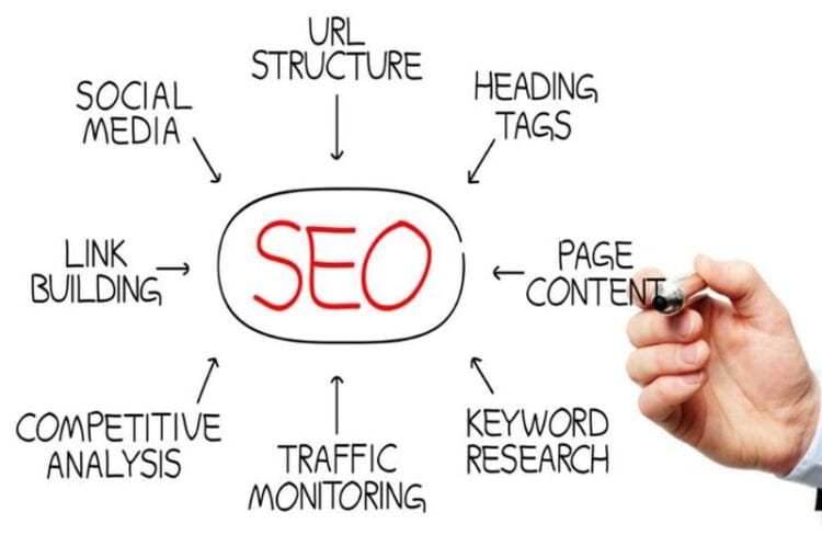
Is the content optimized for SEO?

You may have a problem if you didn’t take the SEO system seriously when designing your page and due to neglecting the fact of it’s importance for search engine positioning. Well, now you know you made a mistake – and try not to make it again. You can choose the best fit design templates for your business and customize them the way as required. All the files are designed in Adobe Photoshop and HTML for framing creative artworks and innovative website structure.
Talk to the company you entrust your redesign with and let them do the SEO optimization. There are many ways to achieve this. Make sure your URL is associated with a name. Keywords should be frequent and part of URL and photography arl – fulfilling such requirements will only make Google take even better care of the positioning of your website.
Pay attention to page titles as well as links between the pieces of content. Make the texts readable and clear. It would be good to check the time it takes for the page to load, as we all know how annoying it can be – actually, it’s one of the main reasons for leaving a website quickly.
-
Adaptability to mobile devices
Without the existence of a mobile version of your webpage you can greatly ruin customer experience. Maybe this didn’t seem so important to you a few years ago when you paid to design a website or it was too expensive for you. But now it’s definitely the time to change that.
There’s a big chance that your competitors have already provided their customers with this option. We’re witnesses that people today like to do their shopping mostly from the comfort of their home – and with this feature they’ll be able to do it from their bed or any other place where it’s impossible to bring a computer.
So why not give them that pleasure and increase your views? Make a wise move and optimize your web platform for smartphones and make your product available to everyone at any moment.
-
New marketing ideas

How you’re listed in the virtual market could depend a lot on your marketing activities. Check out all the ways you can fix them and make some serious effort while getting inspired by the ideas of other website owners and producers.
Connect your official email address and the accounts you have on social networks with your webpage. In this way, you’ll let customers know how they can get in touch with you and where they can get familiar with the offer too. Keep them informed about what’s new and share news via social media but try not to overdo it as you might become too intrusive.
Look for professional digital marketing services. Some of the agencies have worked with companies that are rather well-positioned today thanks to their assistance to various kinds of clients. Explore such companies, have a look at their previous works and reach for such services if they seem adequate for you and your needs.
-
Make it more responsive
Leave space for a chat window in the lower left or right corner of the page. It’s another channel of communication and you’ll let them know that you’re at their disposal and available to them at all times.
Leave all the necessary contact information in some part of the homepage that you have previously intended for this. Your availability at any moment is the key to success, as clients will always have confidence to reach you and will be grateful for the promptness and quick response.
Take the opportunity if you are already redesigning your site to do so in the best way possible taking into account all of the above. This list could be longer but it’s made up of the key things to consider. We leave the rest to your imagination and creativity – ‘cause, after all, you’ll see by yourself what the things without which your online promotion will flourish are!

